Friday 30 March 2012
Thursday 29 March 2012
Feedback
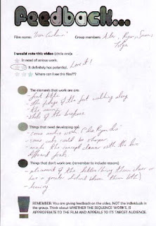
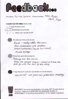
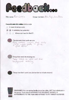
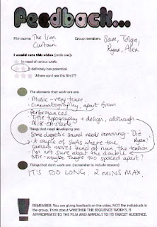
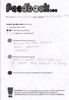
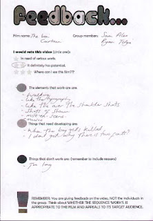
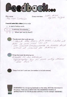
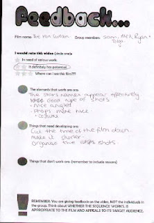
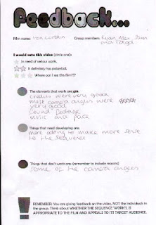
These are the audience feedback forms for our title sequence 'The Iron Curtain'. The feedback will be very useful to assist us in editing our title sequence. Mainly for scenes which may need to be taken out or sounds which may need to be added or taken away.
Monday 5 March 2012
Final Evaluation
In what ways does your media product use, develop or challenge forms and conventions of real media products?
For our media product we use forms and conventions from real media products, we did this to see what our and the audiences reactions where. This allowed seeing what was popular and unpopular with the audience, which helped us see what people who are interested in them films would like to see in the future. As we were looking at a psychological war-thriller we had certain conventions, which would be beneficial, if we used them such as, mystery, violence, spies, time setting and death. The title sequence we made as a group consists of all of these that we continually improved on once we learnt more about our film. Our first idea was to use actual archive footage from a speech by John F. Kennedy; we believe after watch other historical film base in the last 100 years, this would involve footage which everyone knew about for example films based in the second world war would show the prosecution and execution of Jews. We believed the would give the audience a feel for the film.
How does your media product represent particular social groups?
Our media product represents several different social groups for different reasons. As the film is based around America and Russia during the Cold War (1950/60s), we decided to make it as unbiased or patriotic to one nation as possible. This allowed us to create mystery and a more intelligent approach to making our title sequence; also it didn't isolate a social group. As are film is based in the Cold War it is difficult to aim at a modern social group. Perhaps middle class families, people interested in the cold war or just want a film that makes you think.
What kind of media institution might distribute your media product and why?
Looking at the budget we planned for our media product. As we planned a budget of $80 million we believe the best distributers would be Universal Pictures, We looked intensely into which studio would be able to fund our media project and how many big budget films they make, also the genre of film was important because we wanted production company which has made films similarly to ours. This lead to Universal Studios.
Who would be the audience for your media product?
For our media product we were looking between the ages of 15-35 years old males who are interested with this genre of film. I think one of our biggest selling points is that it based around the cold war, which has been very successful in profit and awards. As a group we wanted to aim our film to a wide audience so we thought that making the film unbiased to both American and Russian would lead to more people going to watch our film.
How did you attract/address your audience?
To attract/address our audience we used star power and an enticing story, which other films like this are very popular but with mystery to give a new feel to the genre. We look at star power and the first name, which came to mind, was Leonardo DiCaprio, as he is one of the biggest stars today we thought it would guarantee a fan base audience. We also thought of Colin Hanks because of his farther being Tom Hanks. By picking these stars we hope it could bring a new audience to films based during the Cold War.
What have you learnt about technologies from the process of constructing this product?
From constructing this product I have learnt a lot about technologies and how to use programs such as Final Cut to a reasonably high standard, once learnt I can understand why this is a better program for making a title sequence the iMovie whilst in the past I would have found difficult to use Final Cut I think it is much easier to get the best from our title sequence by using this. Also an important part of our title sequence typography, it took us many websites to find the perfect font for our film but with short cuts it made the process much easier.
Looking back at your preliminary task, what do you feel you have learnt in the progression from it to the full product?
Looking back on our preliminary task I believe as a group we have significantly improved on our skills on making a title sequence as a team. I think at first there were some issues on communication but was dealt with quickly, as we started to plan dates on filming and the preparations before hand we were able to get the most from our title sequence. I think this was one of the most important things as everyone knew what they had to do and when the deadline for which we set. One thing in which we struggled with was other commitments but we adapted to the changes and continued. Also the locations had to be changed several times which made filming longer then necessary. Overall I think everyone had a role to play in making the title sequence which lead in my opinion, a successful title sequence.
Sunday 4 March 2012
Relocation-Church

We have decided to change the location to a church, this is because it gives a timeless effect with will help us as its based between 1950/60s. We had to call several churches before one allowed us to film in their church. As a group we had to set times and dates where we were all available and edit our storyboards.
Our Production Company Issues
At first, our production company was going to be called 'Star Productions' which we decided at the beginning of this project but, after consulting within the group and outside the group I thought we may need to change the name to relate more with the genre of film we are making.
This was the original logo.
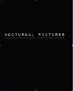
This is what I recommended.
I thought this was more suitable as I creates a sense on mystery and the word Nocturnal meaning: Nocturnality is an animal behaviour characterized by activity during the night and sleeping during the day. The common adjective is "nocturnal".


Saturday 18 February 2012
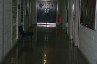
Journal-Filming Test Footage
On the 16th January we started to begin filming for our title sequence. We started by using a corridor in our school, this was because our first idea was to use a office area. This is a piece of our footage.
After we looked over all the footage we thought it would be necessary to re-film, perhaps look at our cinematography and the location. We are looking for a 1950/60s look which is quite hard to do with a school so we may have to consider changing our location to somewhere timeless.
After we looked over all the footage we thought it would be necessary to re-film, perhaps look at our cinematography and the location. We are looking for a 1950/60s look which is quite hard to do with a school so we may have to consider changing our location to somewhere timeless.
Audience Typography Feedback
As a group we felt it was important to see what other people thought about our typography for a title sequence, we gave out some hand-outs and explained what the film is about. Two of the typographies were very popular with the audience which, we now plan to use for our title sequence. I think the two most popular typography seemed to stand out and easy to understand which may be the reason for it popularity. Below are some scanned copy's of our feedback forms


Journal-Google Calendar
In todays lesson our group set up a google calendar that will everyone in the group with organisation and communication issues which we have had in the last few weeks, the main purpose of our google calendar was to keep up to date and keeping to deadlines so we can finish our title sequence on time.
Below is a sheen shot of what our google calendar.

Below is a sheen shot of what our google calendar.
Thursday 2 February 2012
Animatics
Above is the animatics video our group has made from our storyboard, the reason for creating this video was to show our title sequence in real time. It gives us an idea on what the title sequence will look like once finished.
Journal
In Wednesday's lesson we began to work on our storyboard to help make our title sequence.
We knew what we wanted to film and how we wanted to edit but we needed to create the storyboard to stick with so we don't go off course. We also had to put don the transitions that we will be using, the movement of the camera plus diegetic and non-diegetic sound.
We knew what we wanted to film and how we wanted to edit but we needed to create the storyboard to stick with so we don't go off course. We also had to put don the transitions that we will be using, the movement of the camera plus diegetic and non-diegetic sound.
Once this is done we will be adding them to Final Cut to make a animatic that will help so timing of our title sequence idea.
Wednesday 11 January 2012
Title Sequence
We have finished a storyboard of our title sequence, as a group we decided that each person will take part by drawing a section of the title sequence. The storyboards had to be done by the 9th January which everyone in the group stuck to. The next stage will be making an animatic of our title sequence.
- Universal studios credit
- Star Productions credit
- JFK Archive Footage – 10 seconds maximum
- Leonardo DiCaprio credits
- Tracking shot of man(1) walking down corridor
- Close up of shoes
- Close up of suit
- Close up of gloves
- Over the shoulder shot
- Close up on bottom half of face
- Colin Hanks credits
- Man(2) looking out window (over the shoulder)
- Man(1) approaching door
- Close up door handle opening
- Man(3) getting shot – entering room, shooting man
- Shot from behind man(3) now dead, man(1) out of focus in background taking briefcase
- Producer credits in scene
- Man(1) leaving from with briefcase
- Close up of man in window, background out of focus
- Man enters threw door, background still out of focus
- Mid shot of man(2) with man(1) entering scene
- Close up of briefcase exchanged
- Mid shot of man(2) with briefcase
- Director credits in scene above
- Fades to Iron Curtain credits.
Tuesday 10 January 2012
Wednesday 04/01/12
On Wednesday we began to work on our storyboards for our title sequence The Iron Curtain
This would make it easier to follow how the title sequence takes place when filming and editing. From this we had to take into mind the camera angles, we want the cinematography to relate to the style of the 1950/60s. Once we have finished our storyboards we will be adding them to Final Cut to make an animatic that will be easier to see how are film will work when including times and effects.
This would make it easier to follow how the title sequence takes place when filming and editing. From this we had to take into mind the camera angles, we want the cinematography to relate to the style of the 1950/60s. Once we have finished our storyboards we will be adding them to Final Cut to make an animatic that will be easier to see how are film will work when including times and effects.
Wednesday 4 January 2012
Location
I have looked into locations in which we could use for our title sequence, I wanted to show threw mise-en-scene that the film is set in the 1950s. First, I thought about 50s style/colours that were significant at the time. The colours seems to be plain and floral which I think we could easily make or portray. The second thing that I thought about was American patriotism, we would show this by the use of guns and perhaps flags.
• Some ideas of offices that we could use for are title sequence.


Monday 2 January 2012
Fonts are very important to set a tone for the film, it gives a identity into the genre of film the audience is about to watch. An example of this would be a history film, we would expect a font which relates to the time period. For our groups title sequence we want a font which shows the conflict between the Soviet Union and America. We may add a hint of colour to represent the two nations, this would most likely be blue and red because these are commonly used to represent capitalism and communism.
Here are some of the fonts we plan to use.
American Style Fonts


Russian Style Fonts


Here are some of the fonts we plan to use.
American Style Fonts

Russian Style Fonts


Subscribe to:
Posts (Atom)